"AidData is a great data vortex."
Attending the inaugural convening of the AidData Research Consortium (ARC) earlier this month, I was intrigued to hear numerous scholars express this sentiment. Participating academics and data scientists recognized that AidData’s subnational, geo-referenced data will enable them to ask novel questions, produce higher-quality data analysis, and suggest innovative solutions which have the potential to improve development outcomes. Seeing this enthusiasm, prompted me to reflect on what must come next. I’ve observed that those who conduct research and those who shape policy sometimes speak very different languages. How, then, can better and more granular data and analysis be practically conveyed in a way that is helpful for policymakers?
Working as an AidData fellow with the Senate Committee on Foreign Relations (SFRC), I have gained a unique insight into what it takes to make data more accessible and actionable. Utilizing various data visualization tools, I produced briefings for senators and staffers detailing the composition and character of aid from the United States and other multilateral and bilateral donors to priority countries. During my fellowship, I realized that substantive information acquired from diverse information sources, synthesized and displayed in a simple, clear, and relatable manner, is necessary for the information to be effective in shaping public discourse and policy.
One graphic and the reaction it produced is case in point. A blogpost by the Center for Global Development's Todd Moss grounded a discussion of the Obama administration's recently announced Power Africa initiative. A visual image accompanying the post compared the annual per capita energy consumption of six priority countries to that of the average refrigerator. This simple graphic left quite a powerful impression upon my co-workers. Abstract power consumption statistics, made even more remote by the minuscule sums involved, were instantly transformed into tangible figures that convey relatable information at a glance. For me, this became the data visualization ideal.
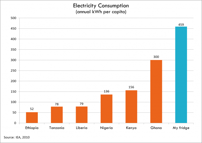
Courtesy image: Todd Moss, Center for Global Development
In my own attempts to produce visualizations to suggest the nature of selected conflicts or compare aid allocations with poverty indicators, I made extensive use of data from: AidData's World Bank: Mapping for Results dataset, the Armed Conflict Location & Event Data (ACLED) dataset, the Geo-referencing of Ethnic Groups (GREG) dataset, and World Bank indicators. It did not take long to realize the power of spatial tools or that, in spite of my enthusiasm, such instruments would require a great deal of practice to wield. However, after some trial and error, I was able to shape what was once a cluttered mass of points and polygons into a map of Sub-Saharan Africa displaying traditional biomass energy usage against deforestation rates. This visualization, along with several others, provided a visual complement to Power Africa briefing materials, making the static data come to life.
After my fellowship with the SFRC, I now have a more complete understanding of the respective challenges that policy and research institutions face. A fast-moving policy environment requires real-time decisions, quickly making sense of vast amounts of data and deriving not only patterns, but also preparing for action. Conversely, the world of research requires reflection and contemplation, patiently analyzing data to identify relationships and causal linkages. Working at the intersection between these two worlds, I have gained an appreciation of how substantive data visualization skills can help bridge the gap. Constructing maps, charts, and graphics should be an important component in building a common language for substantive dialogue between policymakers and scholars. We should do more of it!