It started with a drought.
Back in the winter of 2007, Georgia, USA experienced one of the worst droughts on record. Lake Lanier, one of the primary water sources for the 5 million residents of the state capital, was approaching a level at which no additional water could be drawn. Fingers were pointed in every direction, politicians made long-winded speeches, and water bans were enacted in nearly every district in the state. With no end in sight, the governor - Sonny Purdue - approached the steps of the state capitol building. With the eyes of the state waiting for a solution, he offered one - prayer.
Now, I would be the last to argue prayer was a poor decision in this case - and, for all we know it may have worked given the 2008 floods in the area. However, as a budding geographer interested in how humans interact with the environment I couldn't help but think there had to be a better way. So, I began a research trajectory defined by one broad question: How can we better prepare for environmental change?
Enter GISWhat types of information do you need to really understand a drought? Precipitation, water tables, flow rates, climatology, household infrastructure, land cover, land use, population, social characteristics, institutional rules, city water delivery infrastructure, just to name a few. All of these data are in different forms - so how do we integrate and analyze them in a useful way? For me, the answer to that question was - and still is - Geographic Information Systems (tools for handling spatial data) and Geographic Information Science (methods for analyzing spatial data and developing new tools).
For years I’ve employed GIS to look at issues related to the environment, happily publishing technical papers that would only be read by environmental and GIS nerds (like me). However, itching in the back of my mind was a memory of a governor on the capitol steps, and a desire to see research more directly informing policy. Working towards this goal, I’ve contributed to projects working with local water agencies, urban regional planning groups, the U.S. Army Corps of Engineers, and most recently the United Nations. Then, one afternoon in the late fall of 2013 I received an unexpected email - some place called AidData was hiring, and on paper it seemed like they shared many of my goals. So - caution to the wind - I dropped them a line.
AidData takes the SceneIt was a pleasant spring day when, jetlagged from a string of travel, I arrived for an interview at the AidData office. Chatting with a handful of staff, I quickly realized that the goals at AidData and my own coincided to a degree I don't think either party expected. To a GIS scientist interested in mitigating environmental impacts, AidData represents an absolute treasure trove of opportunity. Imagine suddenly having access to information on where current efforts are underway to improve the resilience of local populations and infrastructures - and then being asked to help research and design the tools to improve that allocation in the future.
My goals at AidData - beyond spatial data mining and analysis - are to produce new knowledge regarding (1) how spatial information can be used to inform decisions, and (2) effective ways to supply and communicate “big data” sources to broad research, journalist, and activist audiences. These goals are closely interrelated - just as many policy and decision makers find themselves faced with unprecedented amounts of data with which to make decisions, researchers are constantly challenged to find interesting trends among terabytes (or more!) of data. In both cases the time and infrastructure required to leverage emerging “big data” is frequently not available, severely curtailing the potential of the data revolution we're living through today.
“Big data” can be a heck of a buzzword, so let’s throw together a quick example. Take a look at this hastily produced map:
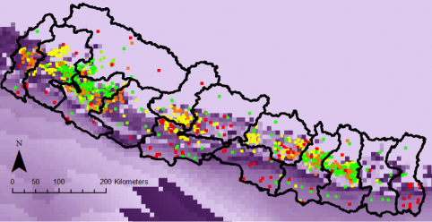
Potential Agricultural Yield (Rice) in Nepal, circa 2020
That’s every recorded agricultural aid project in Nepal (points: green indicates high dollar value; red low dollar value), overlaid on the potential agricultural output (rice) for the country (darker purple shades indicate higher potential yields). Quickly combining this with spatial information on population and infrastructure, we can use elementary machine learning to create this:
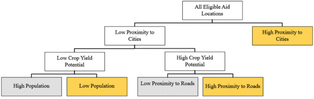
Decision Tree for the Estimation of Project Location in Nepal
Where areas that are likely to have an aid project are in yellow, and those that are unlikely are in grey. Now – this is by no means an academically sound analysis; the sensitivity to unit of analysis, uncertainty in our data, and a wide variety of other characteristics must be overcome before solid conclusions are drawn. What this does show is the potential of these analyses - for example, would we be content if the number one predictor of where agricultural aid is allocated today is the proximity of the project to a major city? Using geospatial technologies we can begin to map what different strategies for allocations might look like, and help identify the concrete steps we would need to take to get there.
This is not a task I undertake alone, and considerable momentum exists at AidData and within the broader development community already. As we get underway, I’ll be providing semi-regular blog updates on the types of spatial research we’re undertaking, as well as our experiences and lessons learned. We’d love to hear what you’re working on, too. Have questions or want to join in on the ride? Shoot me an email, and let's start talking.
