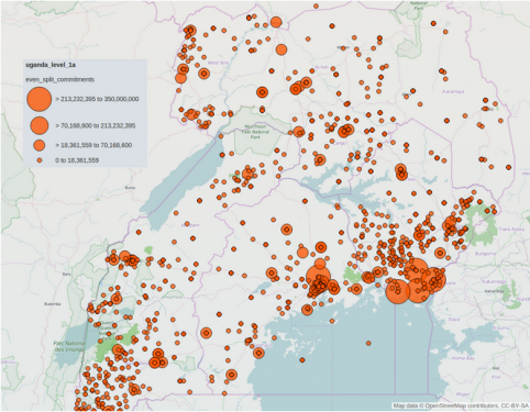
Map visualization of development finance to Uganda from 1978 to 2014 as reported intoUganda’s Aid Management Platform and available as a downloadable dataset via aiddata.org
Last week, we announced the arrival of AidData’s Level 1A data product which includes several improvements that make our geocoded datasets easier to use than ever before. This week, we invite you to join us for a step-by-step walkthrough of some basic mapping and visualization techniques that are possible with the Level 1A data for Uganda. Together, we will recreate the map above using the GIS web mapping tools of ArcGIS Online. Follow along using a free trial account via ArcGIS Online.
Step 1: Get the data, start a new map, and import your data into the software
First, you’ll want to download and unzip the Uganda geocoded data from our GitHub page. Once that has been completed, now you can access the .tsv tables in the ‘data’ subdirectory that compose our Level 1 research release. As you will notice, this is where the Level 1A product is located alongside our standard Level 1 tables for project, location, and transaction related attributes. This Level_1A.tsv file is our focus for this tutorial, so remember where it is stored so we can navigate to its file path when using the file import tool in ArcGIS Online.
To start a new map, log into an ArcGIS Online account and select the ‘Map’ button at the top of your home screen. If you were formerly working on a different map and want to follow this tutorial, save your work and then select ‘New Map.’
To access the file import tool, click the ‘Add’ button in the top left of your new web map’s user interface and then select ‘Add layer from file.’ (figure 1)
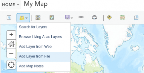
Figure 1 - Finding the “Add Layer from File” feature in ArcGIS
Finally, select the file path by clicking the ‘Choose File’ button, and then select ‘Import Layer’ once it has been chosen (figure 2). When importing, you will be presented with a warning message stating that “this file contains invalid characters or is missing some location data. Not all features have been added to the map.” This is to be expected and can be ignored, as not all Level 1A project locations contain coordinates (specifically those with precision codes 6 and 8).
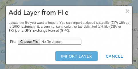
Figure 2 - Adding a layer from the data file
Step 2: Select data attribute to show and how it will be visualized
Once the file import is complete, the left hand side of the interface will present two options under a ‘Change Style’ header. Option 1 is to ‘Choose an attribute to show.’ Here we will select ‘even_split_commitments’ so that this is the attribute visualized on the web map (figure 3).
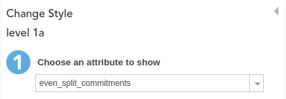
Figure 3 - Selecting the even_split_commitments attribute
With Level 1A, the ‘even_split_commitments’ attribute is our go-to proxy for aid dollars allocated per location. This attribute is representative of a project’s total monetary commitment in 2011 US dollars, evenly-split across the project locations (an assumption we make in place of absent data). For example, if there is $100,000 for a given project, and four locations for that project, each location will have an ‘even_split_commitments’ value of $25,000.
Option 2 is to ‘Select a drawing style.’ We will designate the cartographic styling option with which the ‘even_split_commitments’ value is displayed. While we are presented with a variety of styling options, all which display a preview of how they might look if selected, we will choose ‘Counts and Amounts (Size).’ This option displays the project location points as graduated symbols, where symbol size will represent the ‘even_split_commitments’ attribute. By selecting the ‘OPTIONS’ button, we can change the default styling of this layer (figure 4).
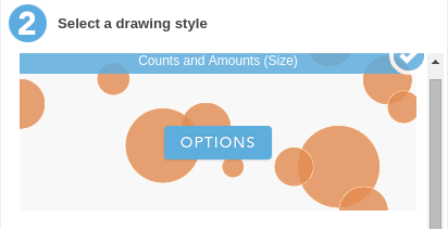
Figure 4 - Selecting a drawing style
Step 3: Styling specifics and data classification
Once in the ‘OPTIONS’ menu of the ‘Counts and Amounts (Size)’ styling mode, the first settings that we will adjust are those under the ‘even_split_commitments’ attribute header and the ‘Size’ header. These settings allow for the styling of map symbols including what sized symbols will represent what range of values (with a variety of classification options), the size in pixels of the minimum and maximum symbols, and the shape, fill, outline, and transparency of the symbols. With all of these options, it is important to note that there is no determinately correct means of styling map data, this being the subjective ‘art’ component of the art and science that is data visualization.
With this map, we chose the ‘Natural Breaks’ option under the ‘Classify Data’ toggle. This classification option best addressed the right-skewed nature of the ‘even_split_commitments’ attribute of this dataset. To create the map from our Level 1A blog post, adjust the map’s settings to match the screenshot below (figure 5). Also, adjust the symbol’s transparency (as opposed to the overall layer transparency) to approximately 25% under the ‘Symbols’ -> ‘FILL’ menu. Once the symbol styling is complete, select okay, and then select done.
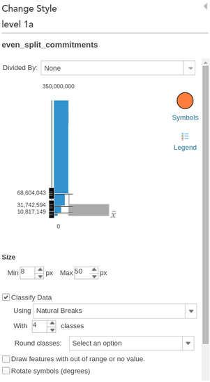
Figure 5 - Map settings
Step 4: Add a basemap and share the web map
The final step to constructing our Uganda Level 1A map is the selection of a basemap for context. We used the OpenStreetMap basemap because it provides lots of detail with a color palette that does not distract from our Level 1A styling.
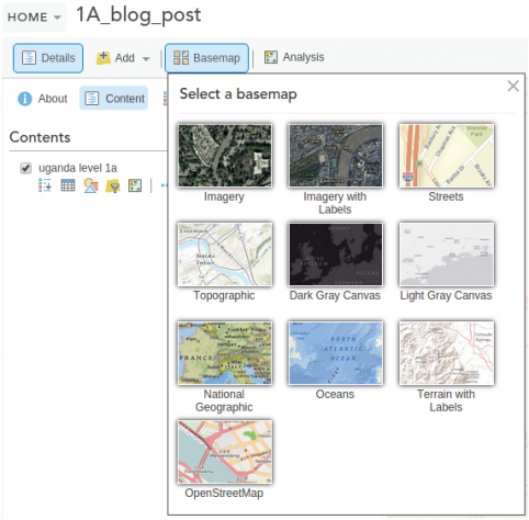
Figure 6 - Selection of basemap layers
After assigning the basemap, set the map extent (defined by zoom level and visible map area) that you would like users to be initially presented with when viewing your map. Then, if you have not done so already, save your map. Next, select the Share button to get a shareable link to the map (alternatively you may select options to ‘EMBED IN WEBSITE’ or ‘CREATE A WEB APP). With these share settings it is important to toggle ‘Everyone (public)’ if this map is to be shared with the public and it is important to toggle ‘Share current map extent’ so that the map is centered on the styled Level 1A data.
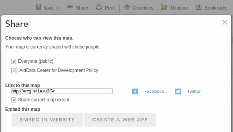
Figure 7 - The share feature of ArcGIS
Congratulations! You have created a styled and easily shareable web map representative of our Level 1A data for Uganda. These same steps can be followed with other datasets and other specified options to create new, unique maps of your own design. Please share your brilliant creations with us by tweeting to the hashtag #AidMap!
“Data of the Month” and “Data of the Week”
As our Data Team continues to provide dynamic datasets, we are announcing two new efforts to break down barriers and encourage further use of our resources. Starting in August, “Data of the Month” will be a monthly series on the First Tranche where we put a spotlight on a recently released dataset and tell a story tying in current events, pressing policy issues, and more. Follow along on our social media accounts for our “Data of the Week” maps, where we’ll take a dataset and focus on unique aspects from different angles using web maps and data visualizations. Be sure to follow along on Twitter, Facebook, and the First Tranche in the weeks and months to come.